
Product Design
Design Systems
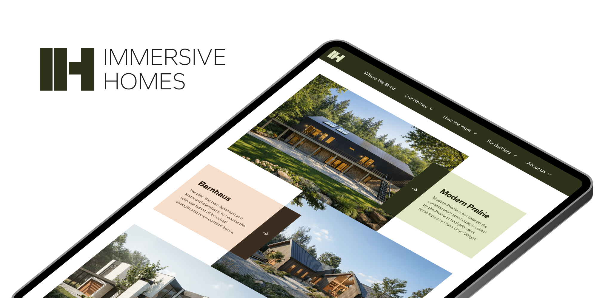
Immersive Homes is a technology-driven home builder based in Grand Rapids, Michigan. I was brought into Immersive to help rework its design foundation.
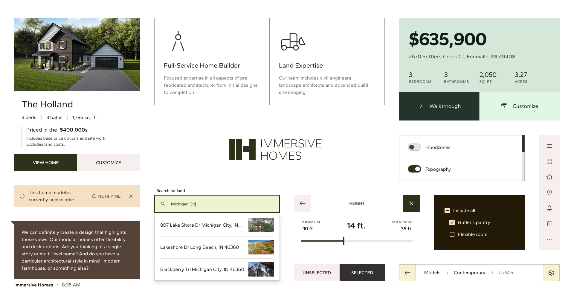
The initial challenge was defining both the scope and the voice of Immersive; what it wanted to say and how it wanted its statement to be translated into their design.
Immersive’s initial brand and design system played it safe. Some elements were heavily based off standard conventions and in turn, it lacked an identity of its own.
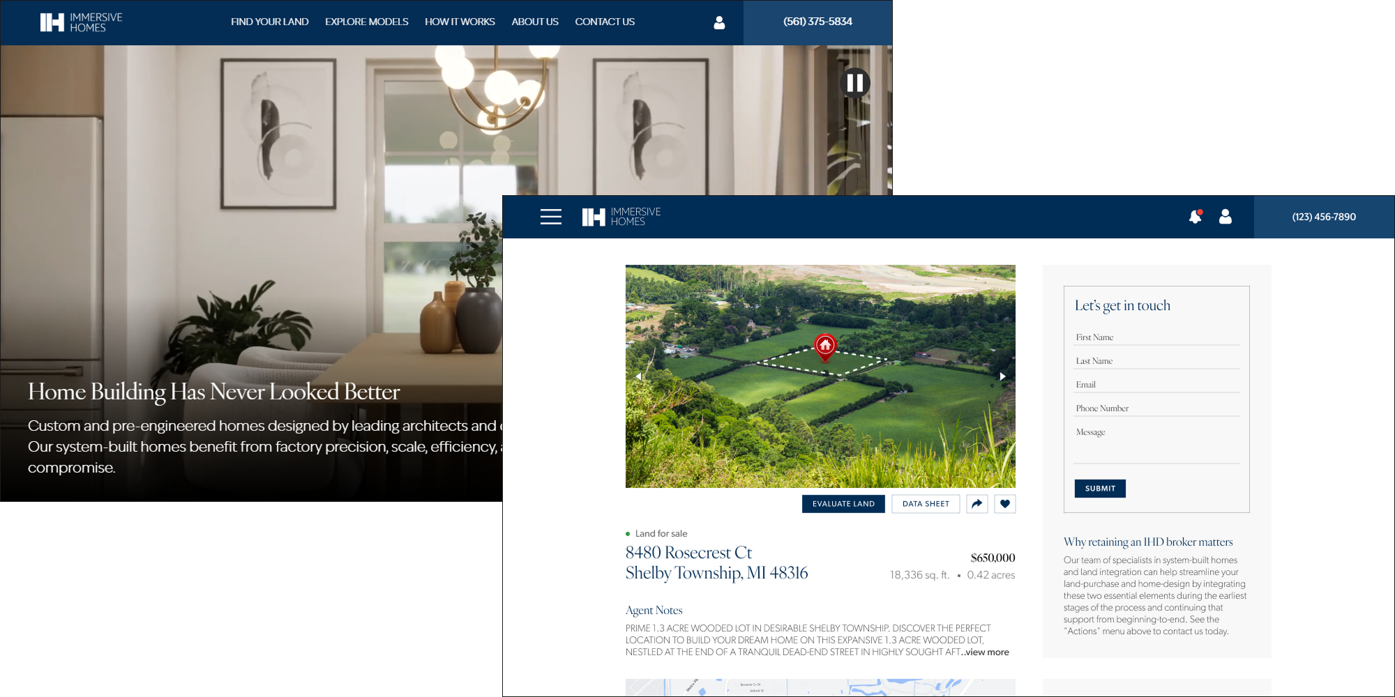
Immersive Homes’ old design system
It also had very little room for expression within its constraints; the palette lacked any sort of accent or deviation from the standard neutral and brand colors.
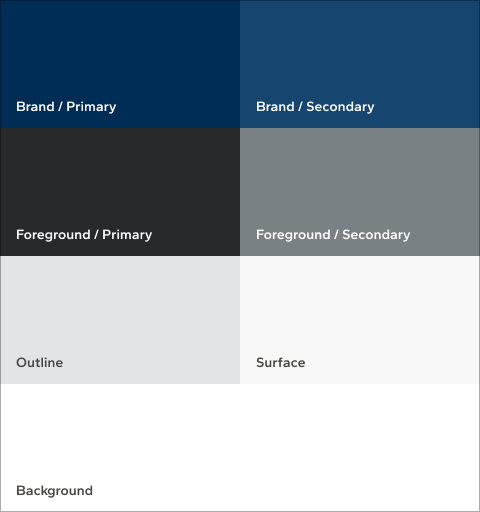
Immersive’s old palette
All of these features combined made for a very muted brand that was merely an afterthought. That needed to change, and a rebrand would need to hit on all of these points.
Rebranding Immersive Homes
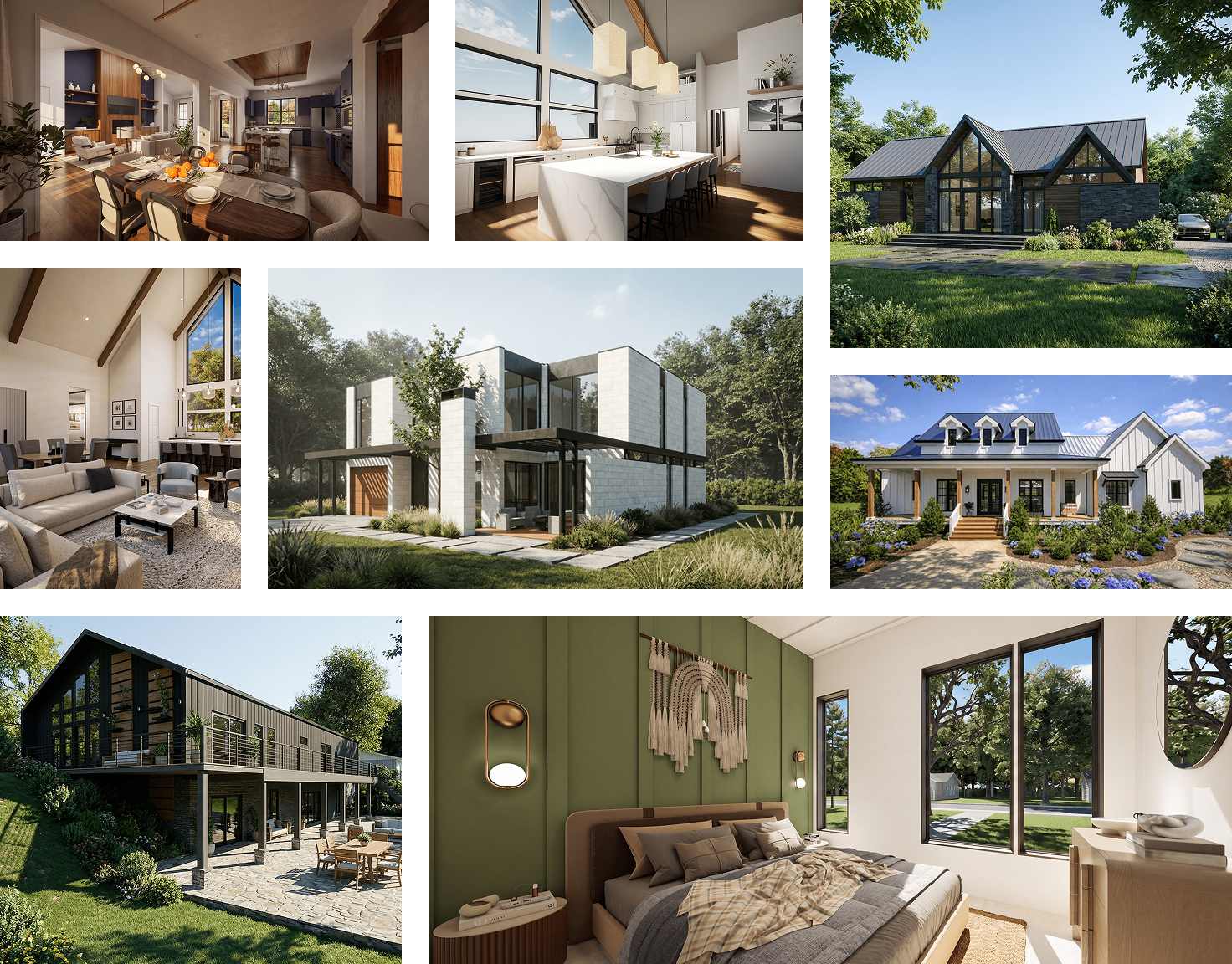
Immersive Homes’ rebrand moodboard
Soft greens, muted olives, and warm browns are increasingly common these days, with more “modern” homes becoming a blend of neutrals and more naturalistic palettes.
Immersive’s new design system took inspiration from its own products and drew a whole new set of colors that allowed it to express itself in different scenarios and adapt its brand to the feel of the content.
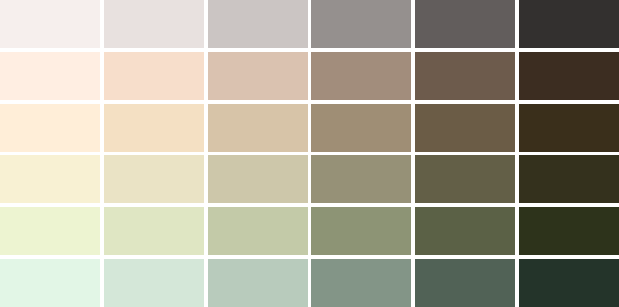
Immersive’s new palette is made up of natural, pastel colors.
Engineering a dynamic color system
Immersive Homes’ new design system needed to be vertsatile and extremely easy to use at the same time. Asking designers to switch tokens manually inferred too much of a time sink and opened the door for potential mismatches. The only way to solve this problem was to create a design infrastructure that automatically mapped tokens to the desired values depending on the needs of the page or component.
Theme, brand & schemes
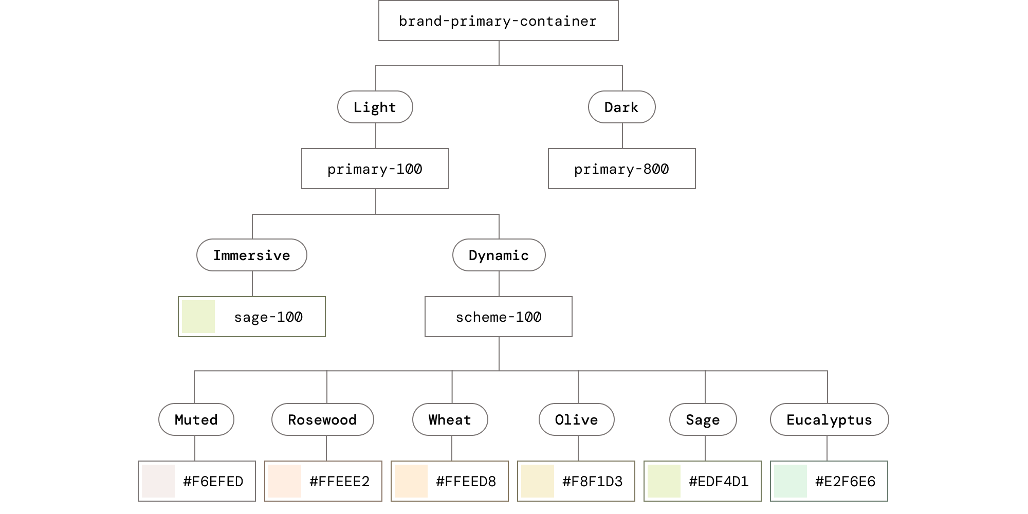
Immersive needed its own brand, but it also needed to be able to adapt to content. This meant it needed to have a default brand, with handpicked values and fixed combinations, but it also needed to map these values to monochromatic schemes when paired with images.
This required a 3-axis solution.
Theme: Can be either light or dark.
Brand: Can be either Immersive or Dynamic. Immersive contains fixed values and pairings that define the brand, while Dynamic switches all colors to a single scheme.
Scheme: Color palettes designed to be used contextually. These are Muted, Rosewood, Wheat, Olive, Sage, Eucalyptus.
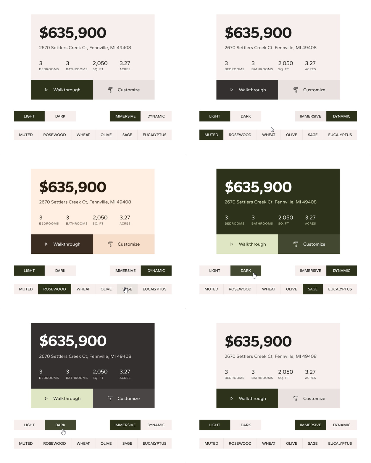
Our 3-axis color system in action.
This theming system is the foundation of every component built for Immersive, allowing precise control of tokens, ensuring accessibility, and providing useful customizability at scale.
Modularity as a metaphor

A great opportunity in this project was the ability to use Immersive’s function as form; meaning that modularity could be both the defining feature of the company but also its brand. The benefit of modular homes is the ability to be assembled and arranged in a variety of different ways to create dedicated spaces.
In Immersive Homes’ new design, alignment and intersection create avenues for content in a way that breaks the conventional column-row paradigms.
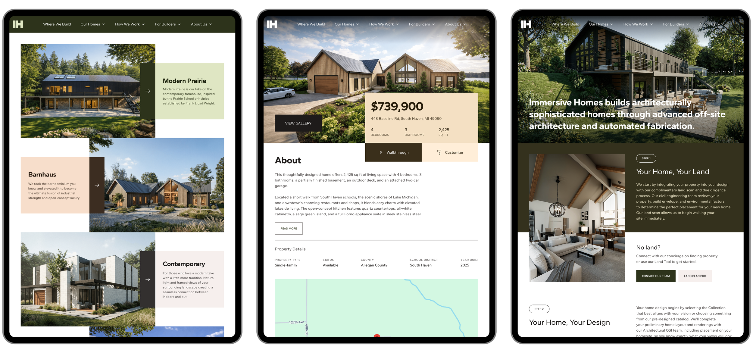
Immersive uses alignment and bold colors to emphasize content
But not every area of Immersive needed this branding treatment. While our bespoke aesthetic was a perfect match for our website, our internal tools did not receive the full array of theming options.
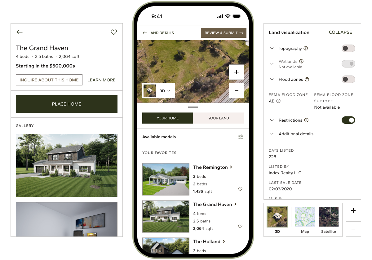
Tools lacked the scheme options to ensure a clean, consistent interface.
Immersive Homes was the biggest project I’ve ever worked on, and seeing its design solidify and sustain itself was a very gratifying experience.
It now stands on a very sturdy, steel-framed foundation.