Interface
Iconography

Introduction
Interval is a time-tracking app for remote workerks.
It was developed by Michael Bullington with Flutter and released in April of 2019.
Establishing structure
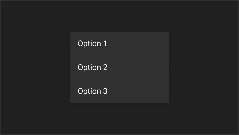
Interval was designed with a goal - to help track work time with a simple and intuitive interface. With that in mind, the concept relied on physical objects - time cards - as the foundation.

By keeping the defining characteristics of a card — the table, the headers, and the arrangement of items — adapting it was a natural process.

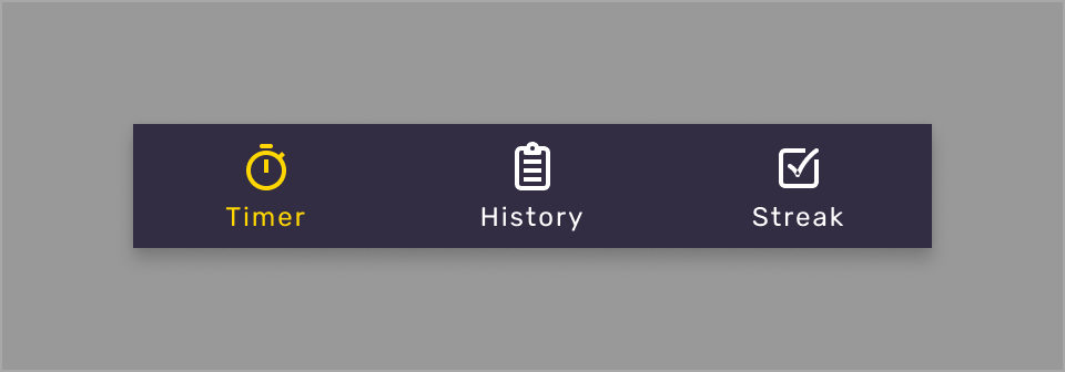
Interval contains three screens: Timer, History and Streak - which is currently unavailable.
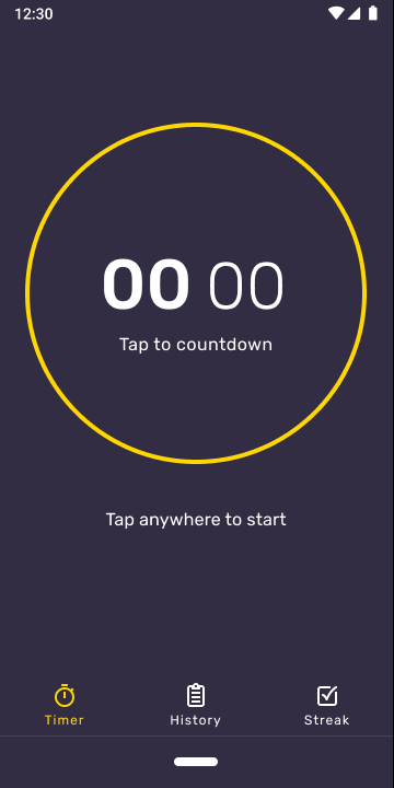
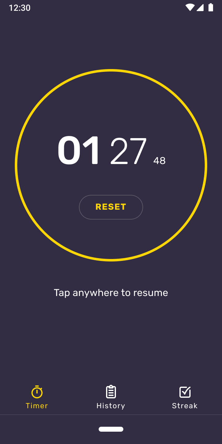
Timer

Due to its simplistic purpose, the timer screen was given an equally simple interaction — tap to start, tap to pause.
Typography plays an important part in its presentation. The text enlarges, filling the screen.
While the timer is running, the elapsed time is automatically added to your history.
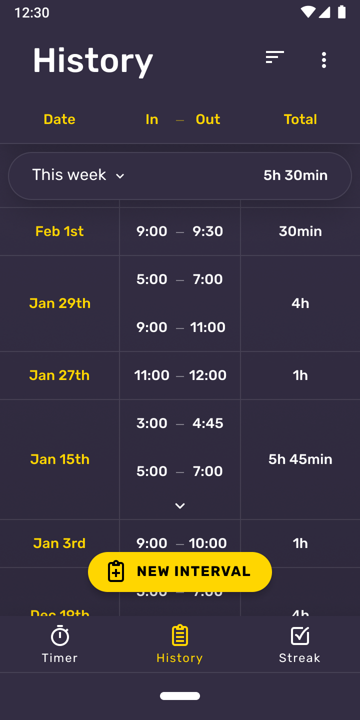
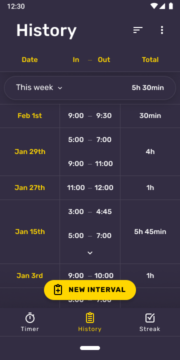
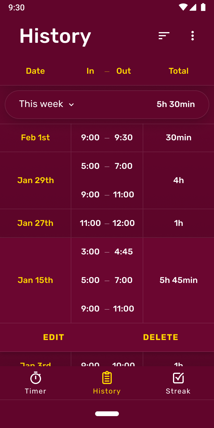
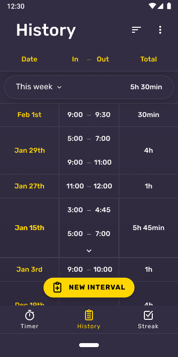
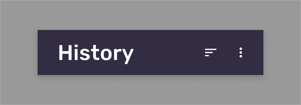
History
History is the most important section in Interval. It’s designed to be easily scanned, provide a list of all of the days with intervals and how much time was spent in each.
But this page contains a couple of quality-of-life features, used to display information in a concise way.
Summary
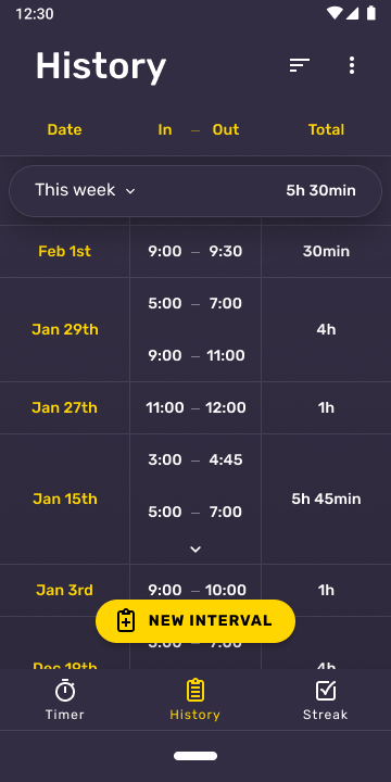
At the top of the list, a fixed dropdown is present that allows the user to see a summary of their last two weeks and a total of all existing intervals combined.
Expandable entries

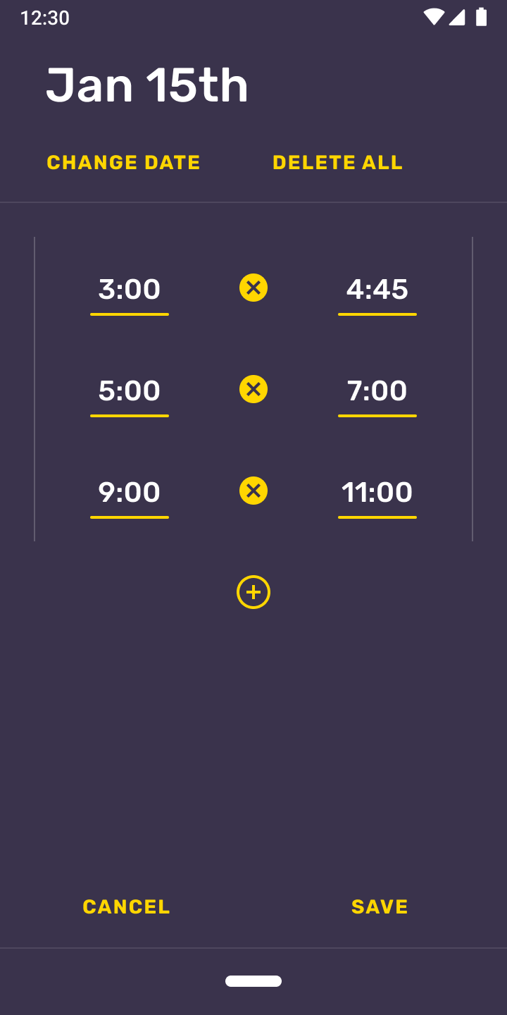
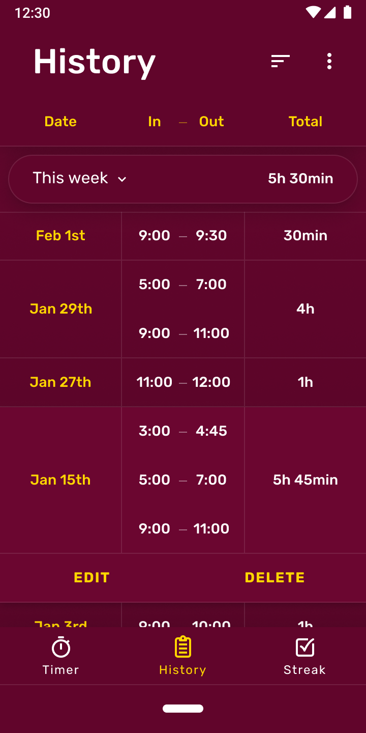
To display more days, items are capped at 2 entries, but can be expanded to reveal all intervals in a particular day.
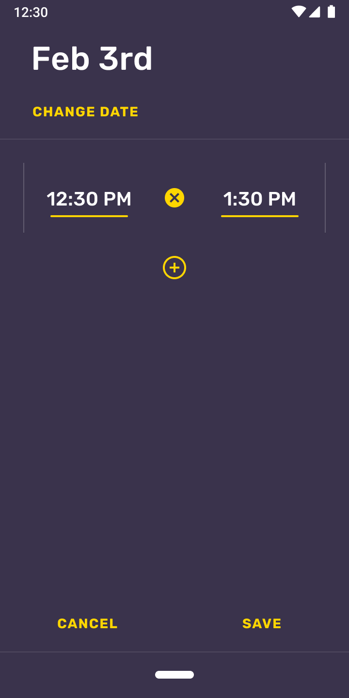
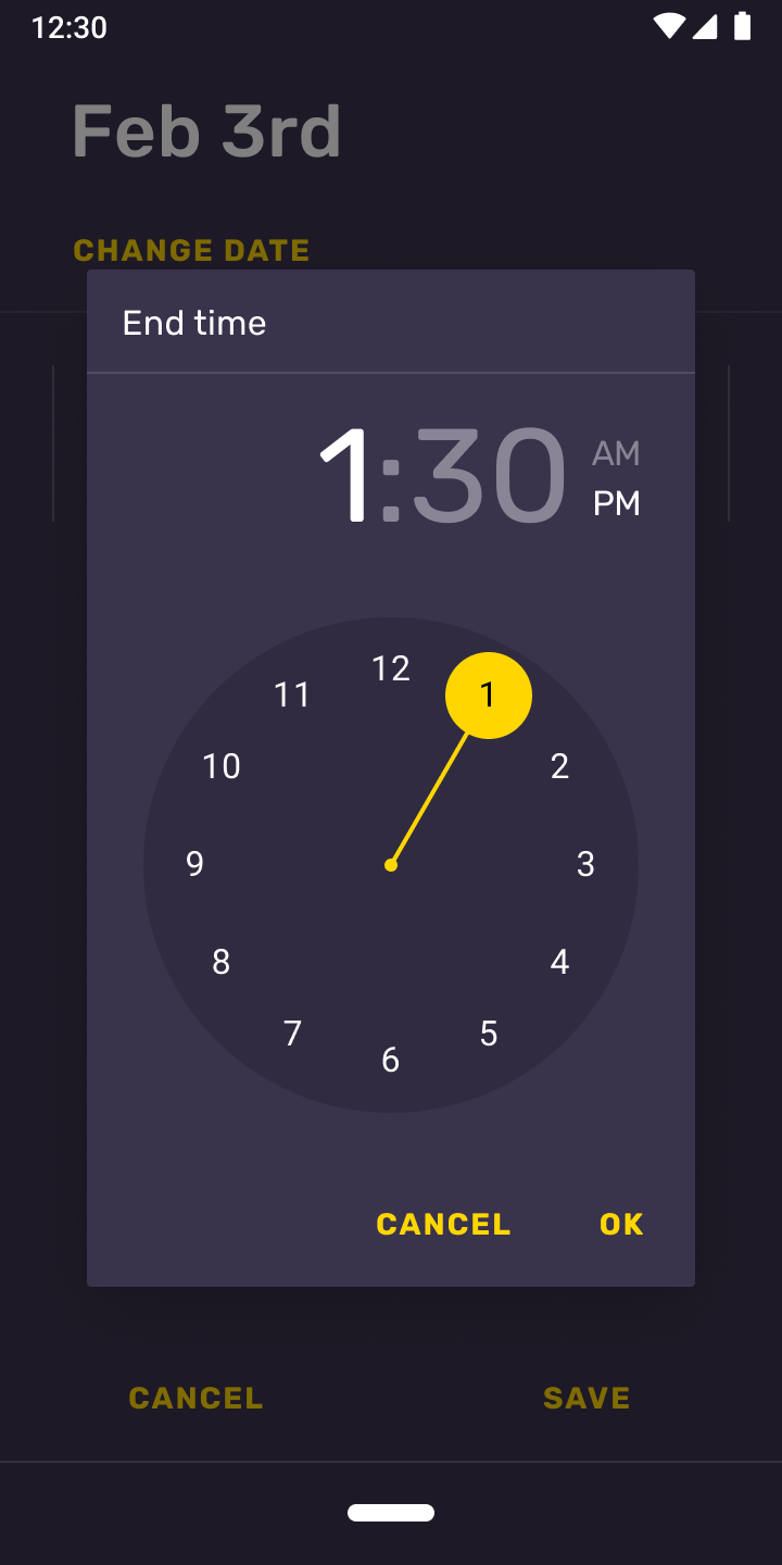
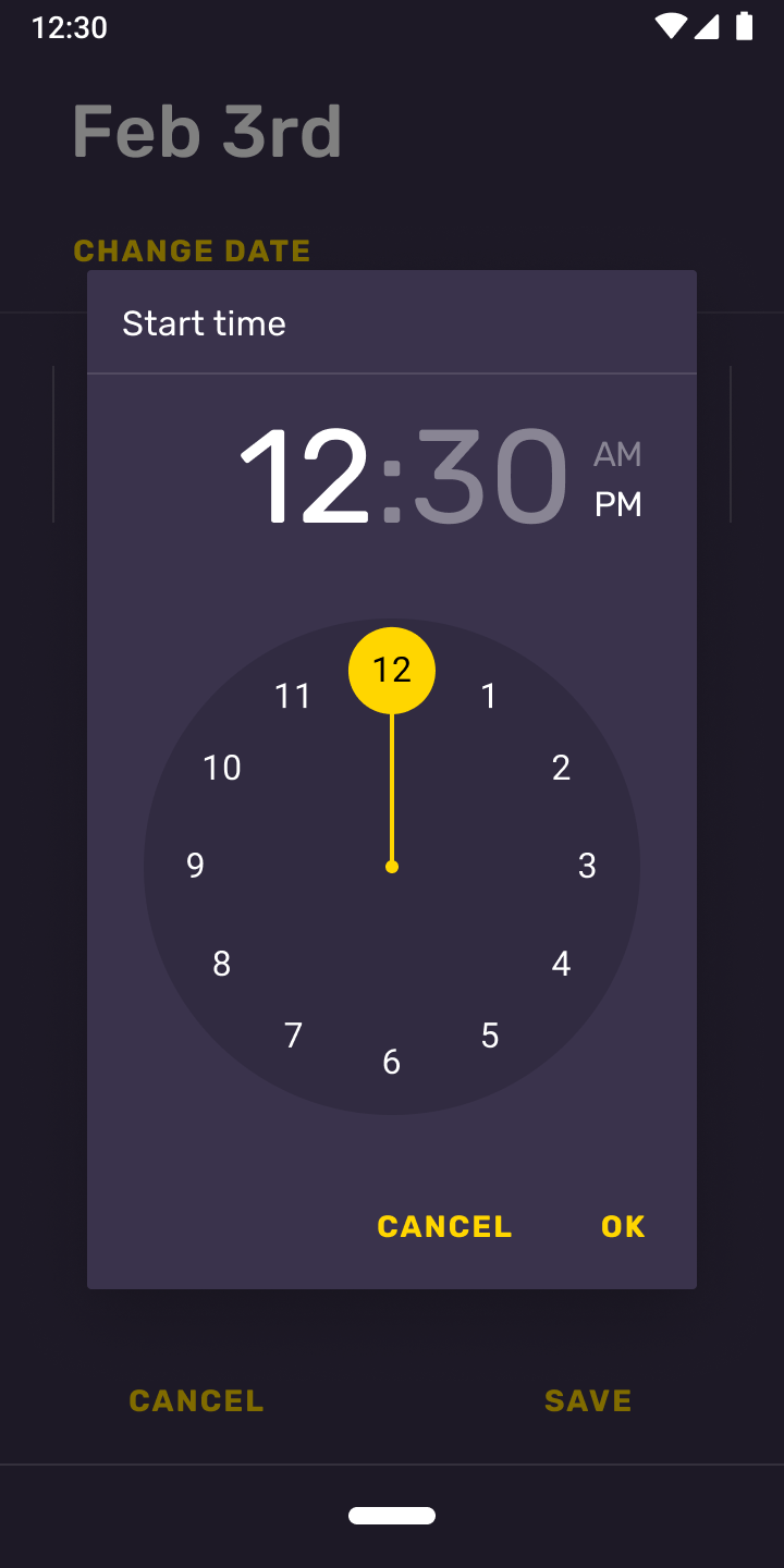
Interaction — Create
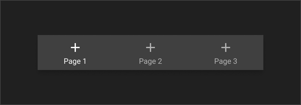
The app adds intervals automatically as the timer runs, but you also have the option to create them manually in case you forgot to track a certain date or period of time.


If the current day is not the intended date, you can easily change it.
Product icon
Interval’s icon went through a few revisions under the same principle; an icon that displayed the app’s time-tracking, some sort of task being done, remotely or not.
Icon iterations
The final result focused on remote collaboration, with a timer symbol instead of numbers.
Interval’s icon also has a free-form version that is primarily used for the splash screen transition.
Tap to play
Hover to play
Theming
Interval gets its basic components from the Flutter framework and customizes them to fit its design system. This includes buttons, title bars, menus and the type system.


Typography
Interval uses Rubik as its main font across the system, replacing the standard Roboto.

Iconography
Icon animations
Icon animations were a great addition to polish the interface in subtle ways.
Tap to play
Hover to play
Timer
History
Streak
Interval uses icon animations for its bottom navigation items.
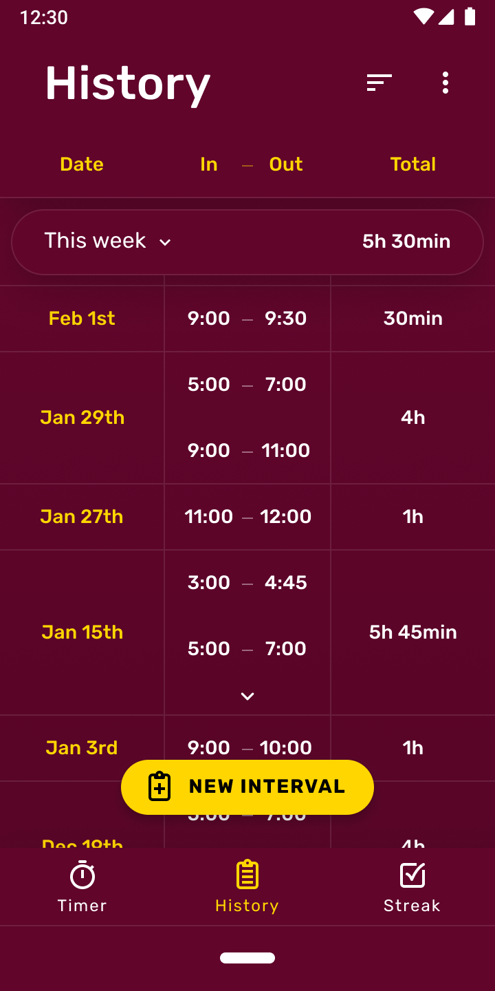
Dark mode
Since the app is already dark by default - with its indigo brand color - dark mode was an opportunity to do something different. At dusk, the app’s base color gradually shifts to red, while retaining the yellow accents throughout. This is just an intentionally exaggerated approach to blue filters.


Wrap-up
Interval was a fun project to work on - it was a very streamlined process with a defined goal, and the ending result achieved all of what we initially set out to do.
Interval is available on the Play Store. Tap on the link below to check it out!