

Product Design
Design Systems
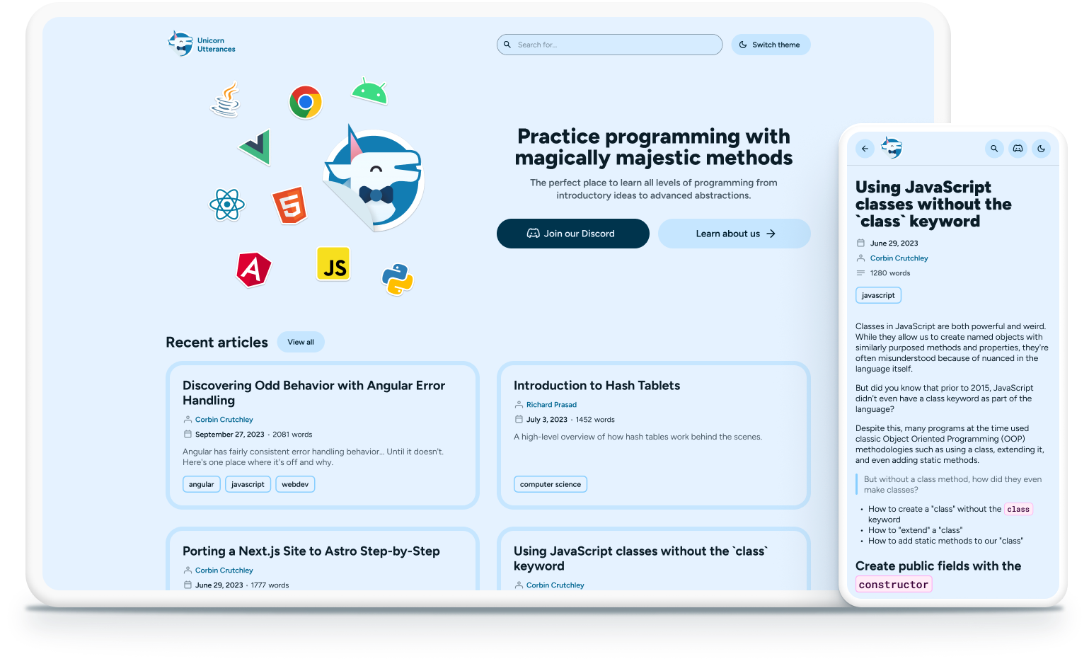
Unicorn Utterances is a community-led website that teaches programming concepts. Its articles range from back-end to front-end, as well as more primitive principles of computer science. I was brought in to remake it from the ground up, with the purpose of aligning its new aesthetic with the final product to create a cohesive experience.
Building the new Unicorn Utterances
The main goal of this redesign was to take something that was traditionally boring and sterile — coding websites — and turn it into a bubbly, fun environment. This meant taking its brand and reimagining it.
We first tackled typography.
Unicorn Utterances was using three different typefaces: Work Sans as a display font, Archivo as a body font, and Inconsolata, a uniwidth font. One of the things that we wanted to achieve was to reduce the page size of the entire website. Fonts are a good part of that, so with the redesign, we chose just one: Figtree!


Figtree was the perfect fit for Unicorn Utterances, as it maintained the qualities of a geometric sans typeface — legibility in small sizes, good rhythm — while being expressive and fun.
Our typescale consists of two configurations, desktop and mobile, which also applies to tablets. This ended up working great for our use-case, reducing the number of styles we needed to support.
We vastly expanded our color palette.
The previous design was monochrome, only adhering to the blue color scheme, in various tonalities. For the new one, we knew we needed an accent color to provide more options to differentiate and highlight different components and states. Pink was easily decided upon, as it’s always been part of the logo and identity of Unicorn Utterances.

Not all of its shades are used, in order to maximize accessibility.

Unicorn Utterances uses translucent overlays to determine states and provide hierarchy for overlapping surfaces.
The new system defines brand colors in two configurations: defaults and variants. Next, we have surfaces, which are translucent values that can be stacked to create hierarchy; these colors are used for states, containers, overlays, borders and more.
We were able to build a robust array of components that met accessibility requirements while maintaining visual clarity and the playfulness we associate with Unicorn Utterances.

One of the funner aspects of the new website was bringing some developer motifs into the design process. If you’ve ever been near a developer before, you know they love their stickers. They love collecting them and plastering them all over their gadgets. So for the redesign, the sticker styling was applied to logos of platforms and languages wherever they appeared in; a good example being our new search experience:

Building for developers, with developers.
Remaking a website from scratch required strategy and planning. With the help of two amazing developers, Corbin Crutchley and James Fenn, I could rest easy knowing that my specs were going to be respected.
Ensuring a smooth developer hand-off
I then set out to create the most well-documented and well-structured design system we could. Colors, border widths, corner radius values, target sizes, max-widths are all tokenized so we could standardize the design process and make screens feel consistent and customizable from a single source of truth.

I had total freedom when creating the token system, which allowed me to define the structure and how deep we could get when using them. We employed component-specific tokens to make it easier for developers and future designers to track values and changes. Specs were made alongside their tokens and their values were specified per breakpoint, to allow for responsive sizing. Developers only needed to copy one text file, and they were good to implement the changes to the respective components.
Below is a real example of a set of component tokens and how they were applied in the specs.


Accessibility was our biggest priority.
Unicorn Utterances prides itself in being inclusive, but the previous accessibility efforts were insufficient to cover all necessary use cases. With the new design, accessibility was a focus from the start.
Of course, as with any design system, ours supports all component states you’d expect.

Our text styles are all tied to rem, allowing them to scale with the browser’s font-size property.

We also employed hidden elements to assist users using keyboard navigation. The search page contains a hidden button that allows them to focus the search bar instantly before navigating to the filtering options.

Elements also use aria-labels to make their function known to users with screen readers.

We then performed several accessibility audits where issues like lack of context for screen readers, insufficient contrast for secondary text colors, and overlapping elements on higher zoom and text size configurations were observed and promptly fixed.
But no size fits all and, like design itself, accessibility is never finished; we don't claim to have perfected accessibility, and neither can anyone. Unicorn Utterances will continue to be updated while focused on this area.
Wrap-up
This was the most ambitious project I've embarked on. Designing for so many situations and edgecases was both fun and challenging. We ended up with more than 150 components, 215 styles and dozens of screens.
I could not be more proud of the team effort that went into this redesign and users seem to have felt the same — feedback was unanimously positive; metrics for the website have doubled, and in some cases, tripled, as a result of its new look.
Wanna check out Unicorn Utterances? Click the button below!