Design Systems
Branding

Introduction
OceanBit was created with a specific purpose: Provide developers with the best and most intuitive tools so they can do their best work, wherever they are.
I joined OceanBit as its Design Lead, building its brand and design system — Seaside.
Building Seaside
OceanBit originally started by using Material Components, Google’s open design system. Shortly afterwards, however, we felt that using those components and attempting to custome them to our vision became a nuisance, so we set out on our own path, and Seaside was born.
When tasked with creating our own design system, I had a lot of research to do, and a lot of decisions to make.
On one hand — I wondered —, we’re designing for developers, those who appreciate the density, the complexity, the 100 different shortcuts scattered around the screen, but on the other hand, we’re also targeting mobile devices, where precision requirements must be lowered.
“So how big should a button’s touch target really be?”
32pt
40pt
Carbon
44pt
Apple
48pt
Out in the real world, there is no real consensus among the biggest design systems. In the end, we moved forward with three different values: 32, 40 and 48.
These sizes covered several different scenarios where a unified measurement just wouldn’t work.
32pt components are used sparingly, mostly in-line with text so they don’t ruin the density or alignment of other components. They can also be used in desktop environments where precision isn’t an issue.
40pt components are the standard. These are buttons, switches, checkboxes, radio buttons, avatars and many others. This is a sweetspot between the Twitter and Google values, and provides an accessible touch target while allowing for dense layouts when strictly required.
48pt components are reserved for specific ocasions, like lists or menus, where too many selections are stacked together, leading to potential mistakes. This allows for imprecision at a low cost, since most of these surfaces are transient.
Cross-platform support
Seaside needed to account for several platforms — iOS, Android, and the web — and with that, it had to incorporate a visual aesthetic that made sense to every user.
While this may have seemed like a gargantuan task a few years ago, platforms have already realized one simple fact: consistency leads to a better experience, and users can switch to and from any platform at any point.
This is best seen by looking at the evolution of design components over the years, and how they’ve merged to one cohesive behavior, just with different visuals. Seaside took notice of this, and its components also adhere to this notion while still keeping its own flavor in terms of design details.
While Android used to deviate heavily from iOS’ switch design, websites continued to adopt it as the default solution, leading to the Android 12 toggle, which is now much closer to the iOS toggle than any other previous iteration.
Android released its own version of iOS’ SegmentedControls and named them Button Toggle Groups. Unlike its iOS’ counterpart, they are never used as tabs.
Seaside, however, lets designers decide whether a Toggle Group should be used as a tab whenever seemingly appropriate.
Layout & spacing
Like many other design systems, Seaside also has its own set of spacing tokens.

These values covered the majority of use cases, and allowed us to control spacing through consistent naming schemes rather than raw values. This holistic approach made our components fit together and form cohesive and predictable layouts.
Colors
When it comes to colors, a lot has been said on how to pick them, including some incredible research by some folks. A lot of the challenge involved is whether or not shades are balanced, an inherently impossible task if you want to keep a color’s individual vibrance intact — check an HCL color space to see how this leads to very muddy colors, however hegemonic they may be.
With OceanBit, we wanted to avoid a simple problem right off the bat: The application of neutral and base colors — the colors that compose the non-branded elements of our products. This is because in some design systems, solid colors are hand-picked and then applied on top of each other.
The problem, however, is that they rely on each other to ensure contrast, and if a designer, for whatever reason, needs to change one of those colors — most importantly, the color of a container —, then they may also have to deviate from all other systems, or develop a hierarchy of ever-changing values.
By using translucency, colors can overlap and evolve alongside its background and ensure contrast in most conventional situations. OceanBit took note of that and applied that same methodology to its system, by separating them into categories.

Accessibility
We take great pride in our commitment to accessibility within our components. With direct guidance from Evelyn Hathaway — our accessibility expert — we ensured our components were usable to a wide range of people without compromising our initial designs.
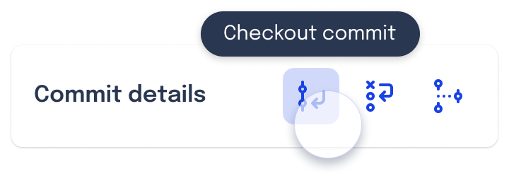
Tooltips
When working with development tools, icons need to convey complex actions, and those are not always apparent to the average user, as no standard has been set. With Seaside, long-pressing on an icon will always show its name inside a tooltip.
TalkBack
On Android, Seaside fully supports TalkBack, a service that reads components and text labels aloud for visually impaired users.
Putting it all together
This all culminates in a UI that is accessible, easily readable, understandable, and visually appealing. GitShark uses Seaside to build its apps, and adapts to the user’s device to deliver a great experience no matter the form factor.

If you wanna learn more about GitShark’s application of UI, click the button below.